iLPS
Institute for women’s empowerment and social reintegration
Institute for women’s empowerment and social reintegration
Institute for women’s empowerment and social reintegration
The company exists with the purpose of inspiring and empowering
people in situations of vulnerability and socioeconomic disadvantage,
creating opportunities for them to achieve financial and emotional freedom.
The company exists with the purpose of inspiring and empowering people in situations of vulnerability and socioeconomic disadvantage, creating pportunities for them to achieve financial and emotional freedom.
The company exists with the purpose of inspiring and empowering people in situations of vulnerability and socioeconomic disadvantage, creating opportunities for them to achieve financial and emotional freedom.
Scope of Work
User Interface
User Experience
Website
Duration
3 Months
Team
Felipe Hoffmann
Breno Lobato
Carol Braga
LET'S START WITH THE BASICS
LET'S START WITH THE BASICS
I was approached to develop a website based on the presentation of the NGO Instituto Livres Para Sonhar (iLPS), with the goal of showcasing the organization and all of its social training programs aimed at reintegrating women coming from the prison system.
Close contact with the users made it possible to highlight the importance of the project and gain a deeper understanding of how to insert individuals into the job market in a qualified way, with opportunities for growth in various companies, while also breaking down prejudices and the stigma that comes from a distant perspective.
To Discover!
To Discover!
Decision nº1
Decision nº1
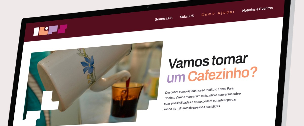
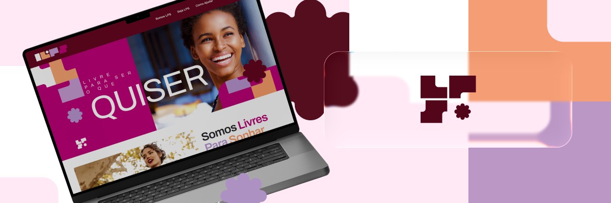
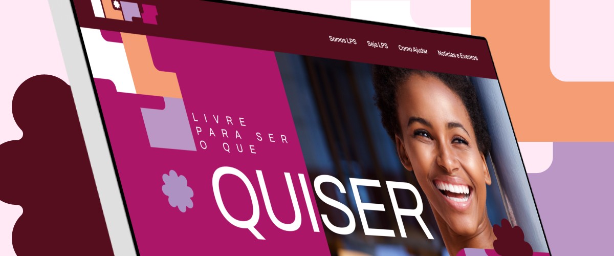
It was important for us to move away from the usual solutions for information media resources and make the site attractive to a young audience. To do this, we chose a block system, bright colors and graphics in the layout, align with the branding book.
It was important for us to move away from the usual solutions for information media resources and make the site attractive to a young audience. To do this, we chose a block system, bright colors and graphics in the layout, align with the branding book.
Decision nº2
Decision nº2
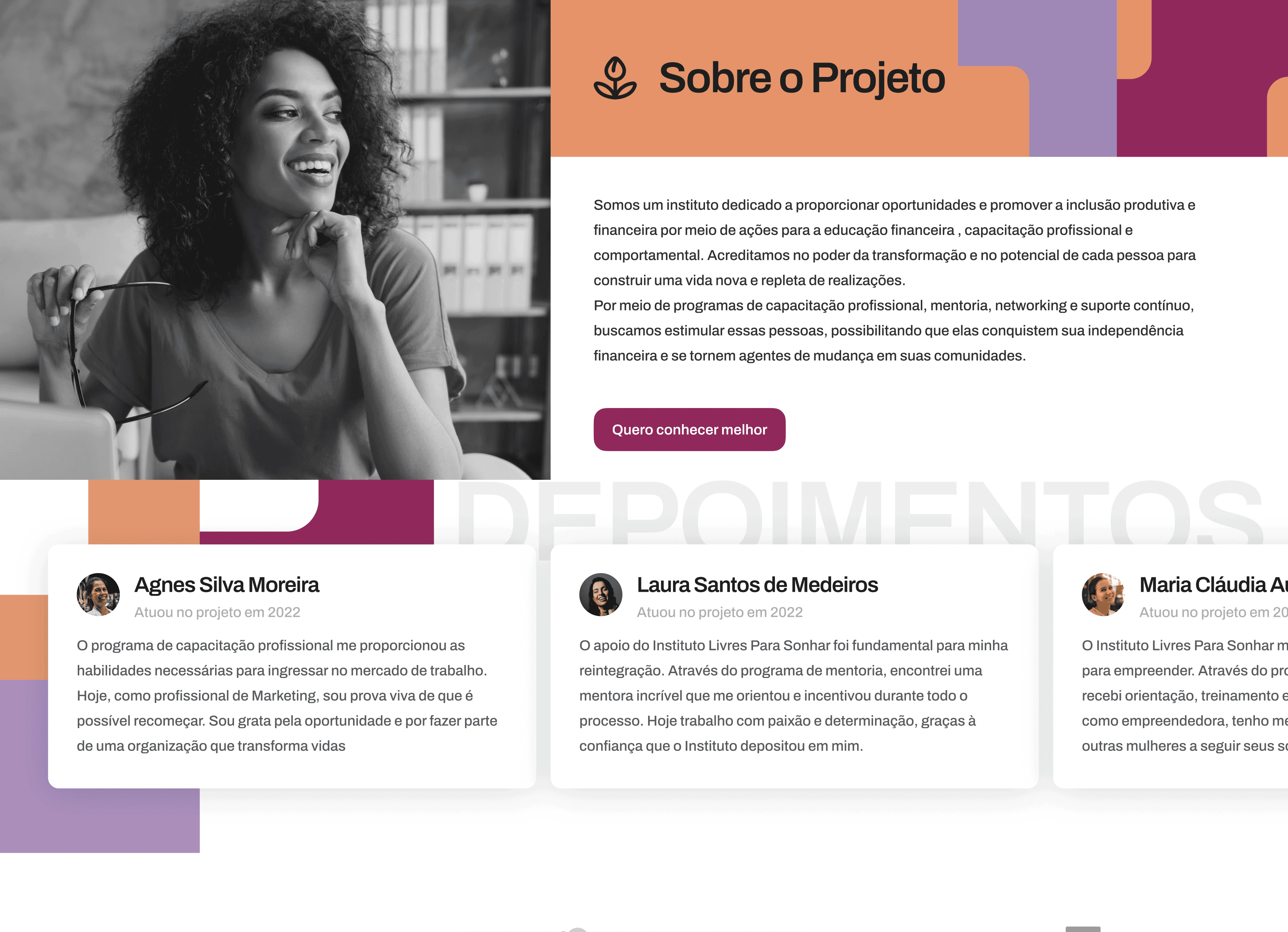
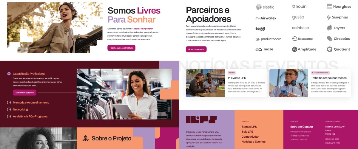
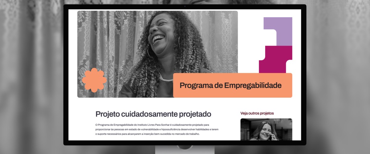
It was necessary to clearly the training programs offered by the organization. From there, we knew there would be a large amount of explanatory content, so we created stages, similar to a blog, providing details of what could be done.
It was necessary to clearly the training programs offered by the organization. From there, we knew there would be a large amount of explanatory content, so we created stages, similar to a blog, providing details of what could be done.
UI-KIT
UI-KIT
Color and typography define style, impact brand perception, and improve user experience by enhancing readability and evoking emotion
Color and typography define style, impact brand perception, and improve user experience by enhancing readability and evoking emotion

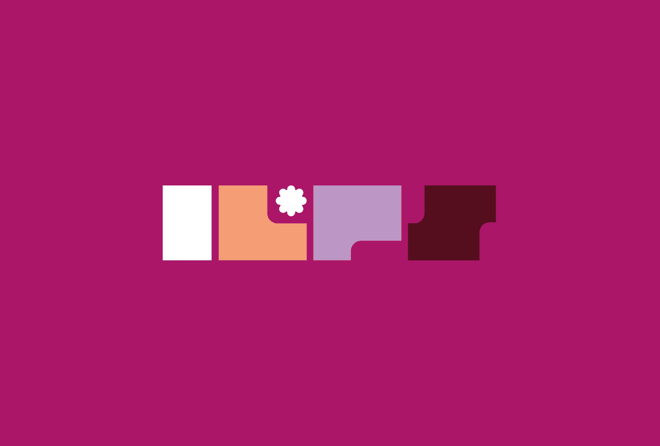
Color
Color
We're commissioned to create a youth-oriented website. To attract this people, a bright and lively design is needed instead of a strict and neutral one - exactly what the client requested.
We're commissioned to create a youth-oriented website. To attract this people, a bright and lively design is needed instead of a strict and neutral one - exactly what the client requested.
Primary typography
Primary typography
For the design, we chose the Archivo Font - it combines strict, typewritten letters and bold lines. It seems that will become quite serious in a little while, but for now, there is a youthful spirit on it.
For the design, we chose the Archivo Font - it combines strict, typewritten letters and bold lines. It seems that will become quite serious in a little while, but for now, there is a youthful spirit on it.

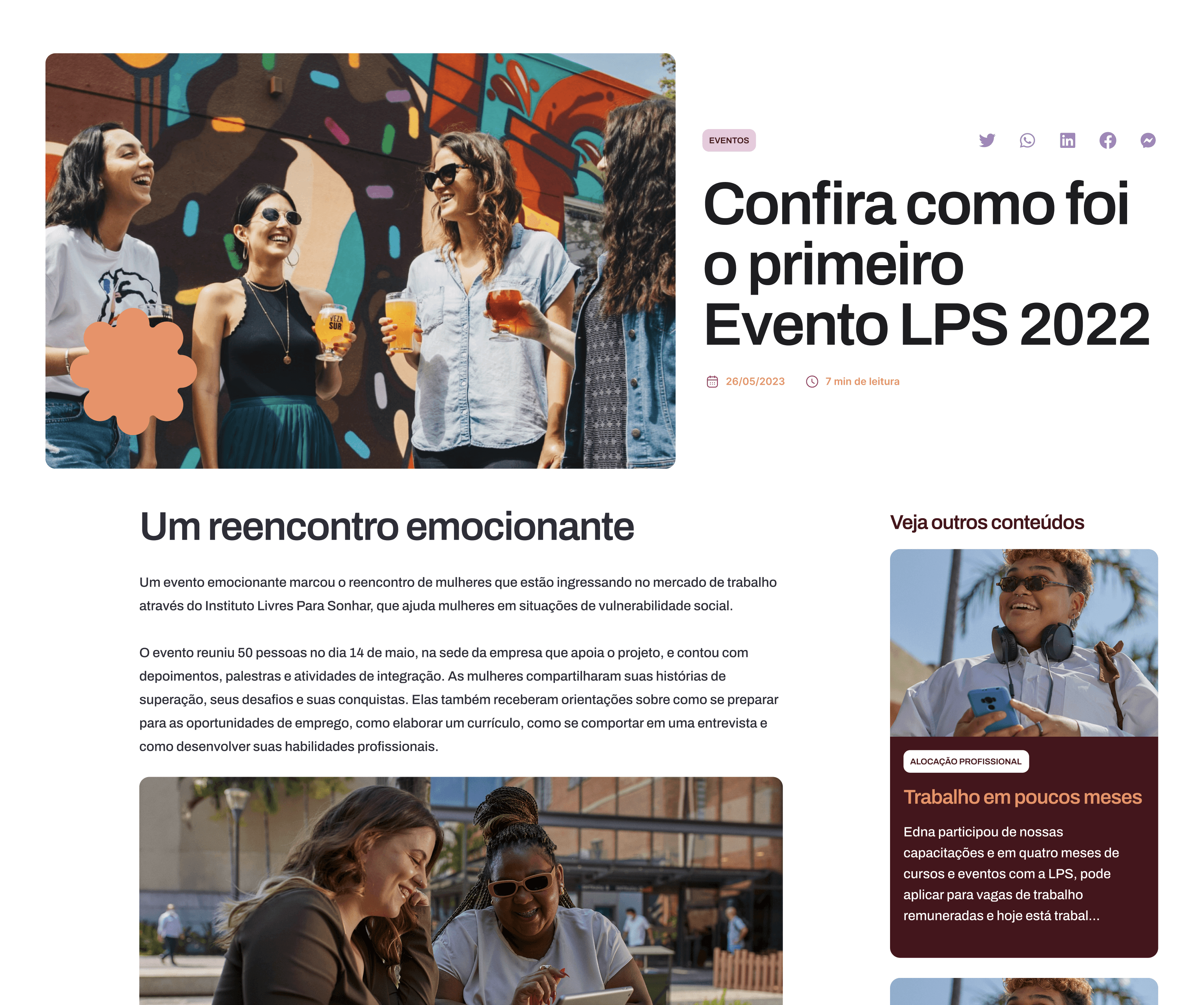
EVENTS AND NEWS
EVENTS AND NEWS
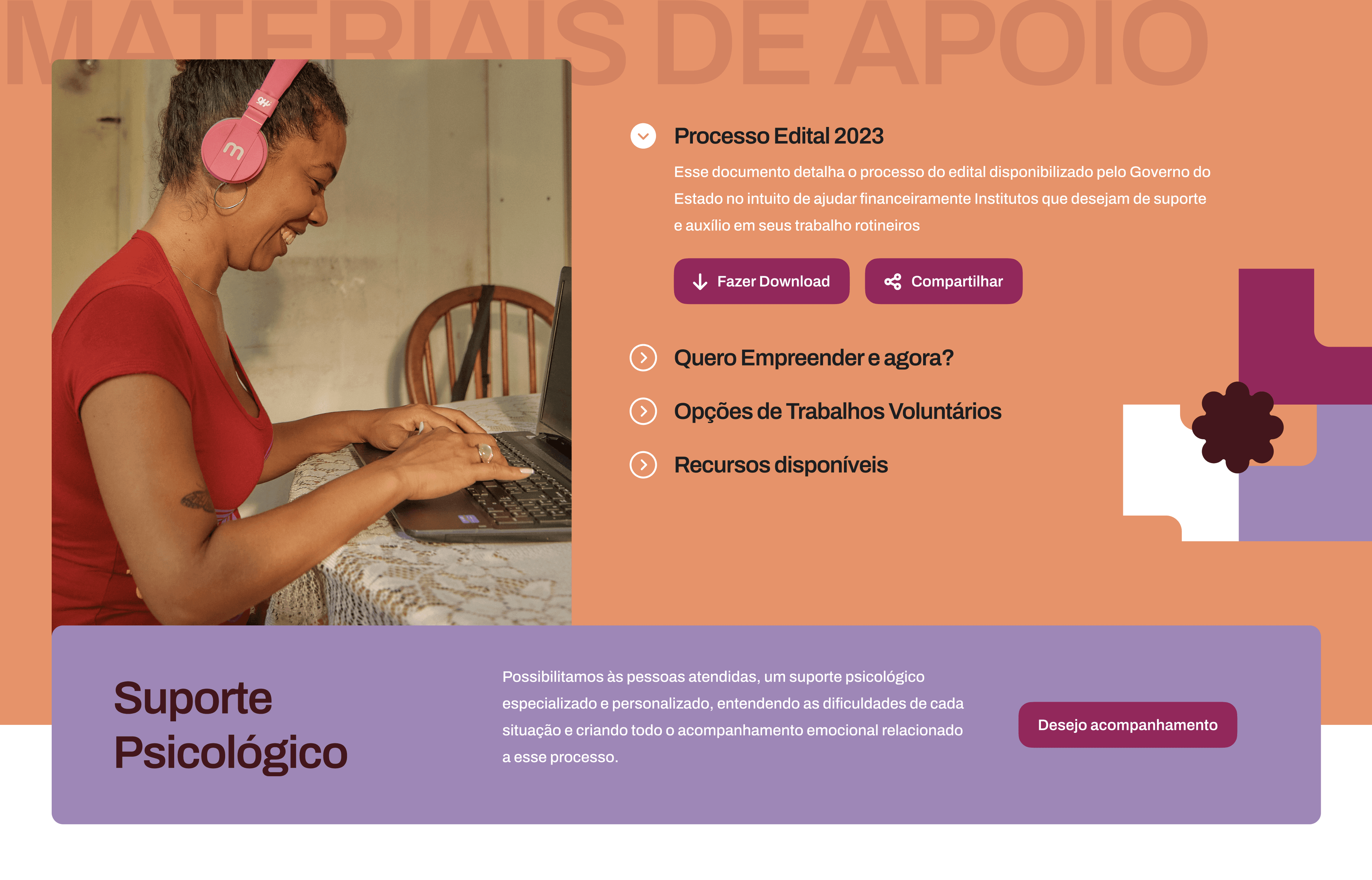
In the "Interesting" section, we share inspiring content, trends, tips and stories to provide valuable insights
In the "Interesting" section, we share inspiring content, trends, tips and stories to provide valuable insights
Content
Content
We decided to give dynamics to the "Main Page". The blocks set the main style, and we supplemented them with movable elements.
We decided to give dynamics to the "Main Page". The blocks set the main style, and we supplemented them with movable elements.
About
About
In the "Info" section, we gather the most relevent events, news, inspiring stories and much more. Boredom is not an option!
In the "Info" section, we gather the most relevent events, news, inspiring stories and much more. Boredom is not an option!